Become a Python Web Developer
Learning Path ⋅ Skills: Web Development, Django, Flask, APIs
This learning path will provide you with the foundational skills you need to become a Python web developer. You’ll cover the most popular Python web development frameworks like Django and Flask, working with databases, as well as fundamental front-end coding skills like HTML.
Become a Python Web Developer
Learning Path ⋅ 18 Resources
Course
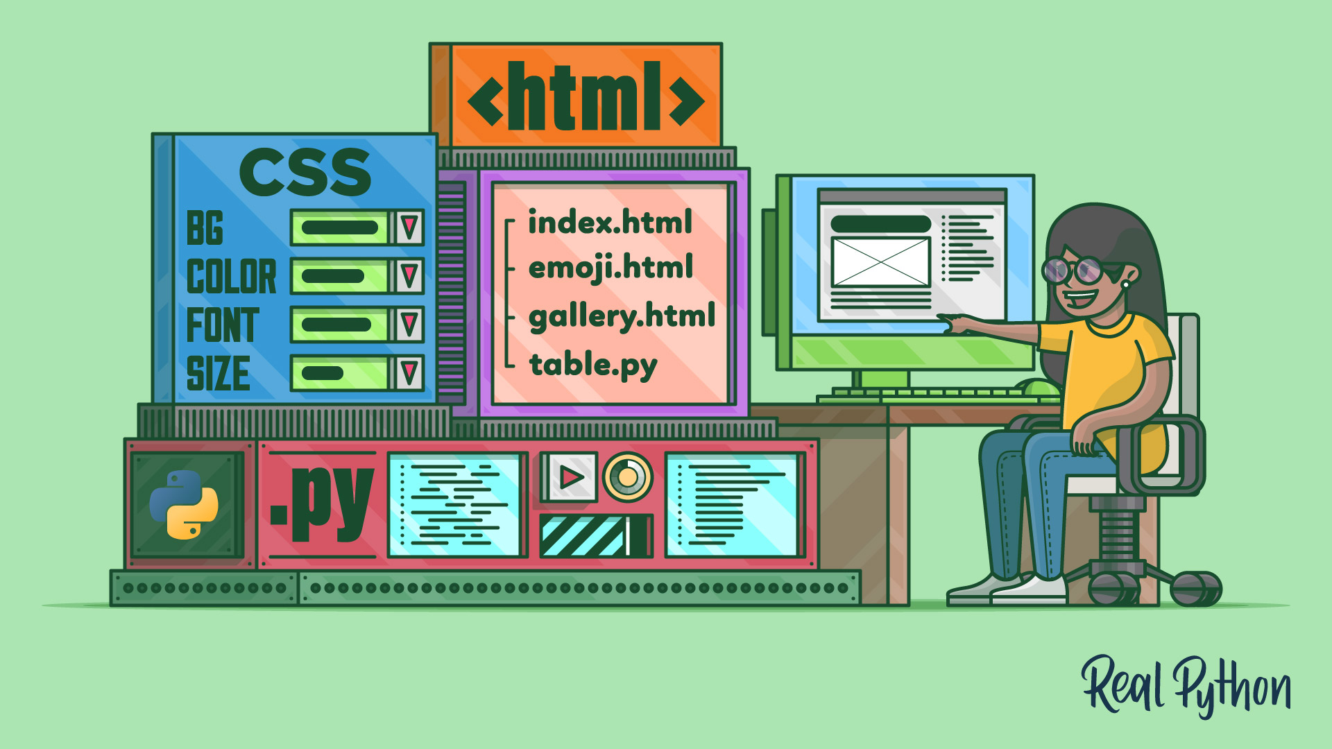
HTML and CSS Foundations for Python Developers
There's no way around HTML and CSS when you want to build web apps. Even if you're not aiming to become a web developer, knowing the basics of HTML and CSS will help you understand the Web better. In this video course, you'll get an introduction to HTML and CSS for Python programmers.
Tutorial
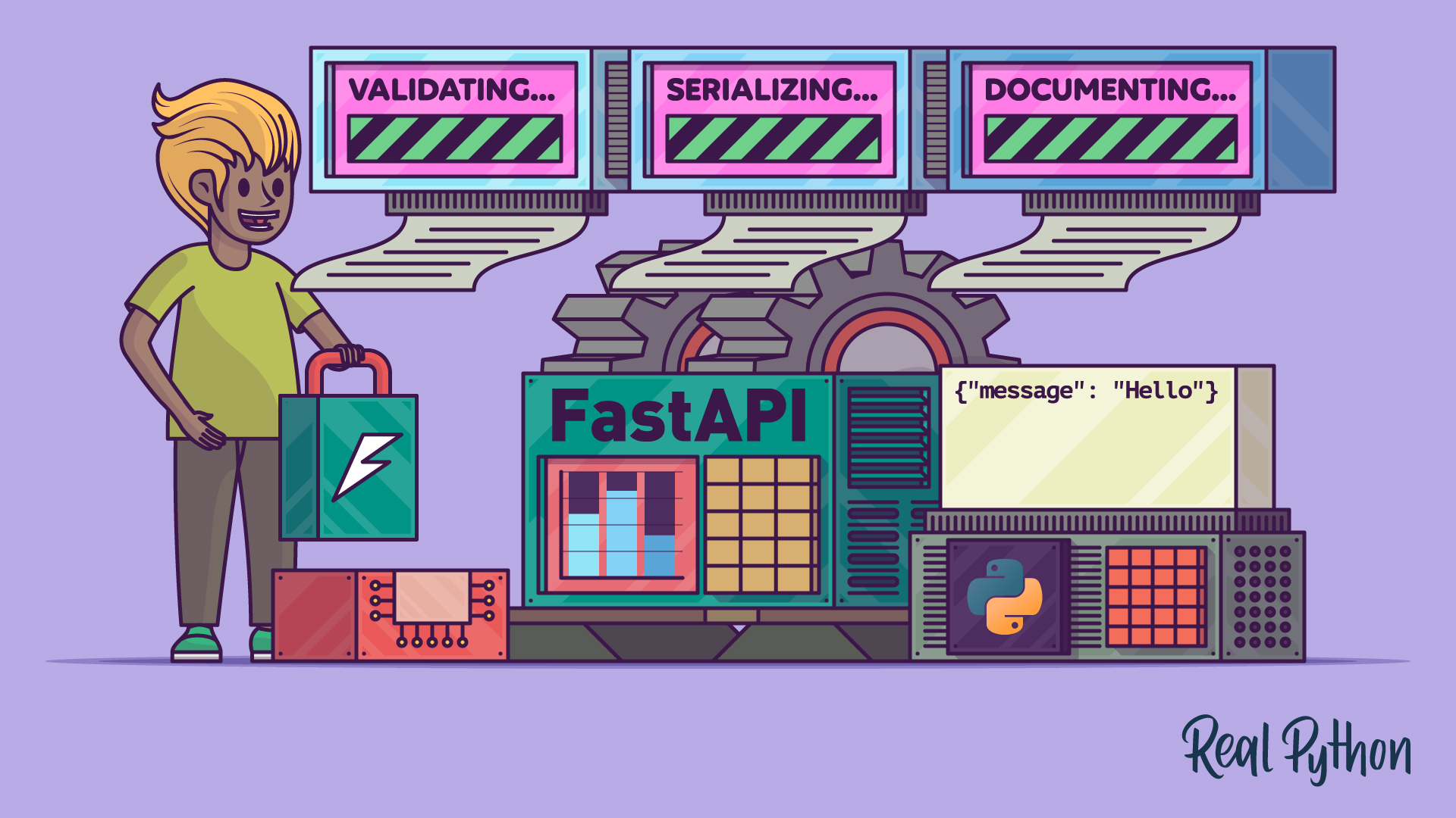
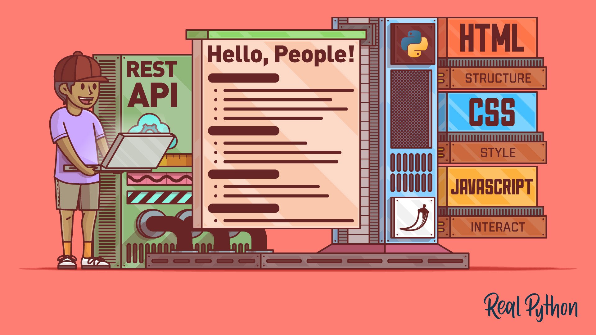
Get Started With FastAPI
FastAPI is the first choice when creating APIs in Python. Explore FastAPI code examples and get the most frequent questions about FastAPI answered.
Tutorial
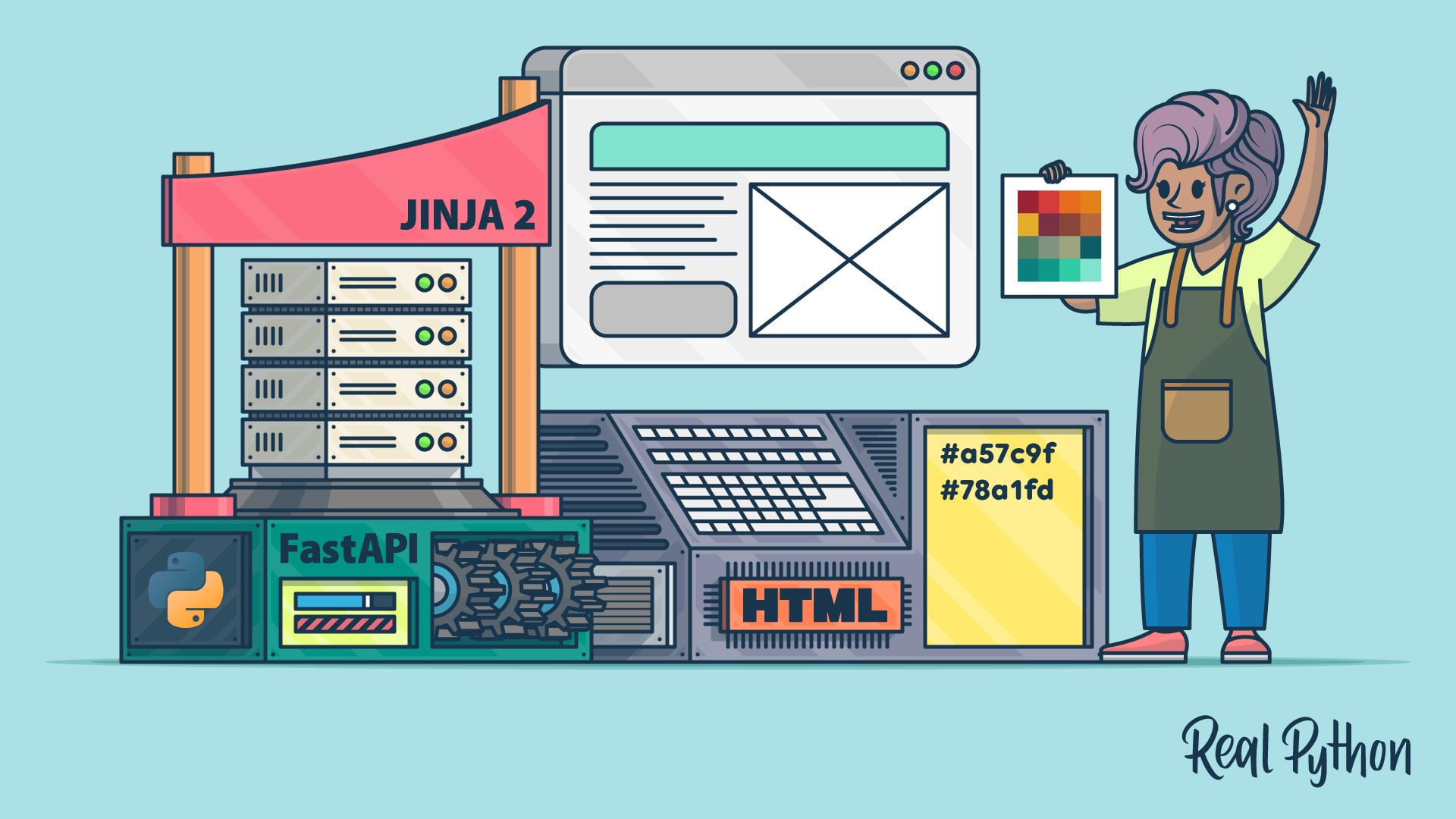
How to Serve a Website With FastAPI Using HTML and Jinja2
Use FastAPI to render Jinja2 templates and serve dynamic sites with HTML, CSS, and JavaScript, then add a color picker that copies hex codes.

Course
Python REST APIs With FastAPI
Learn the main concepts of FastAPI and how to use it to quickly create web APIs that implement best practices by default. By the end of it, you will be able to start creating production-ready web APIs.
Course
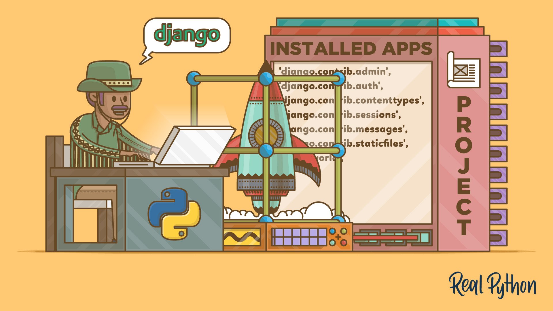
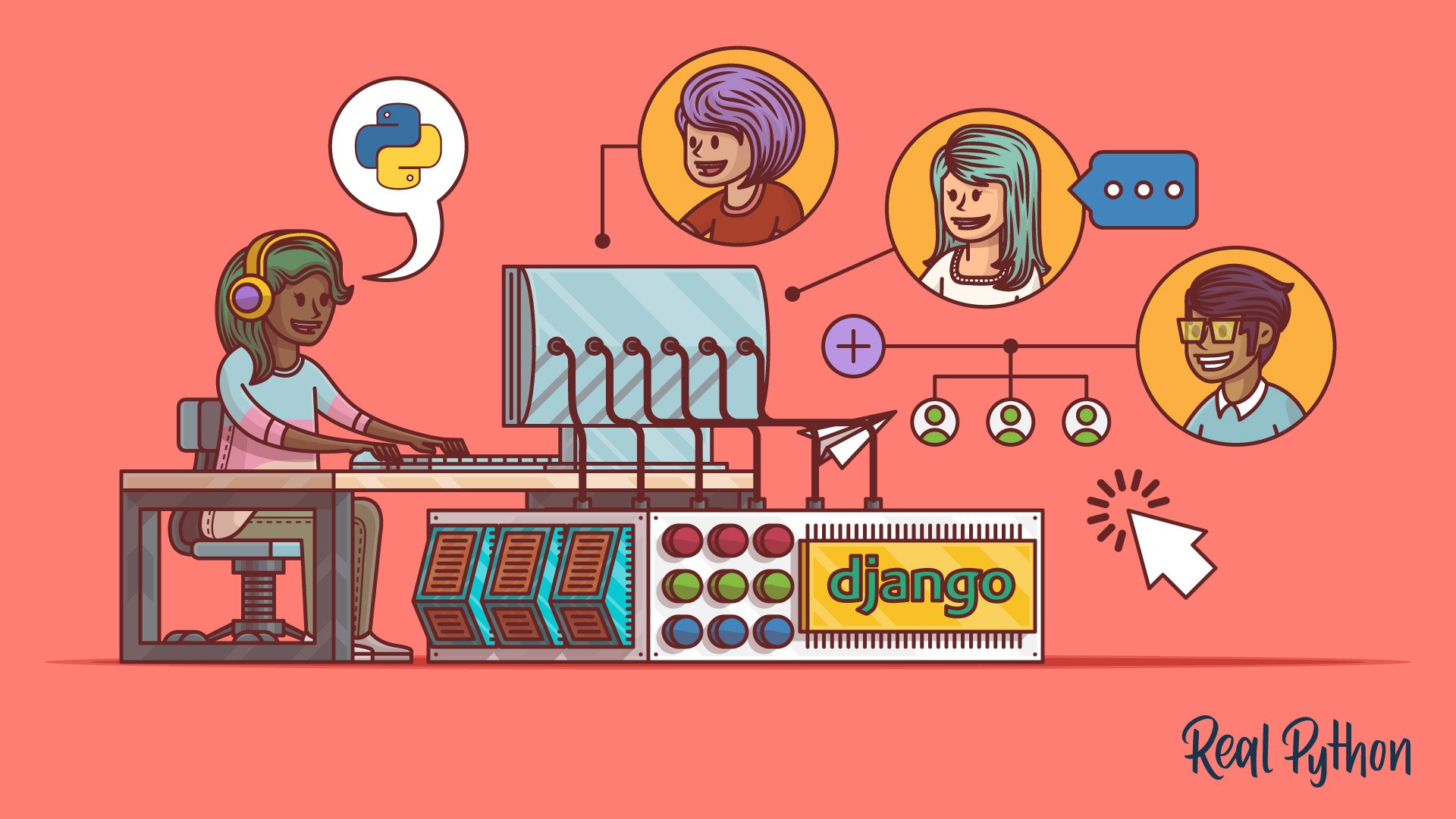
Getting Started With Django: Building a Portfolio App
Learn the basics of creating powerful web applications with Django, a Python web framework. You'll build a portfolio website to showcase your web development projects, complete with a fully functioning blog.
Course
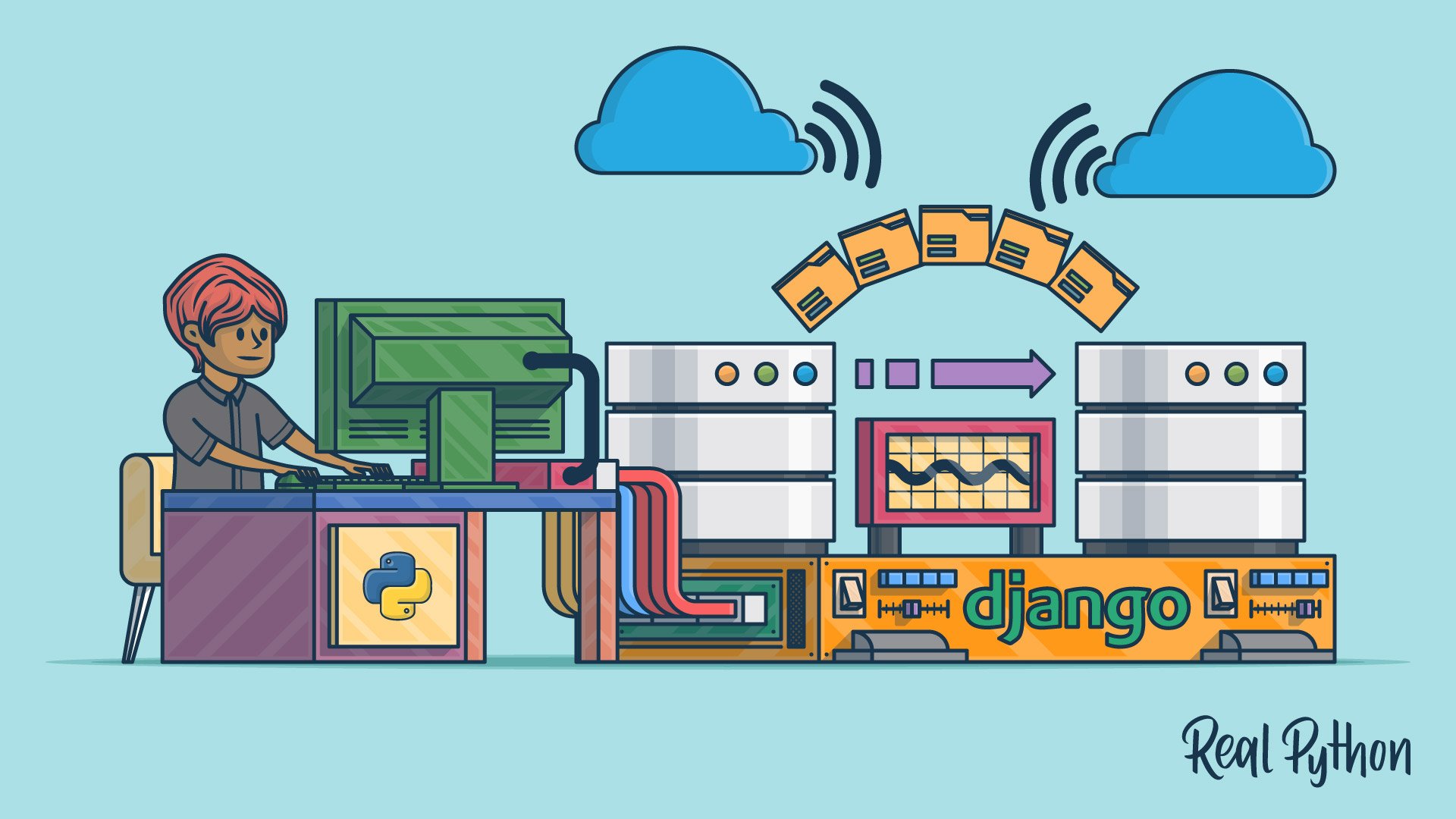
Django Migrations 101
With this course you’ll get comfortable with Django migrations and learn how to create database tables without writing any SQL, how to automatically modify your database after you changed your models, and how to revert changes made to your database.
Tutorial
Digging Deeper Into Django Migrations
In this step-by-step Python tutorial, you'll not only take a closer look at the new Django migrations system that is integrated into Django but also walk through the migration files themselves.
Course
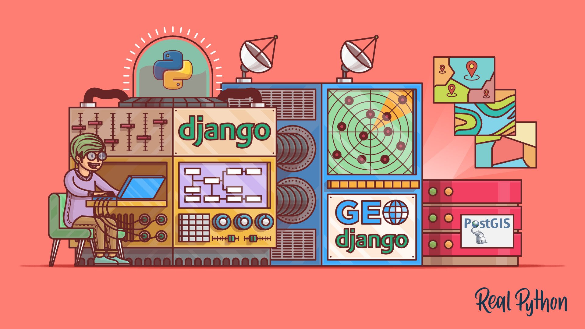
Build a Location-Based Web App With Django and GeoDjango
Learn how to use Django and GeoDjango to build a location-based web application from scratch. You’ll be building a simple nearby shops application that lists the shops closest to a user’s location.
Course
Django Redirects
Learn everything you need to know about HTTP redirects in Django. All the way from the low-level details of the HTTP protocol to the high-level way of dealing with them in Django.
Course
Working With JSON in Python
Learn how to work with Python's built-in json module to serialize the data in your programs into JSON format. Then, you'll deserialize some JSON from an online API and convert it into Python objects.
Course
Building HTTP APIs With Django REST Framework
This course will get you ready to build HTTP APIs with Django REST Framework. The Django REST framework (DRF) is a toolkit built on top of the Django web framework that reduces the amount of code you need to write to create REST interfaces.
Tutorial
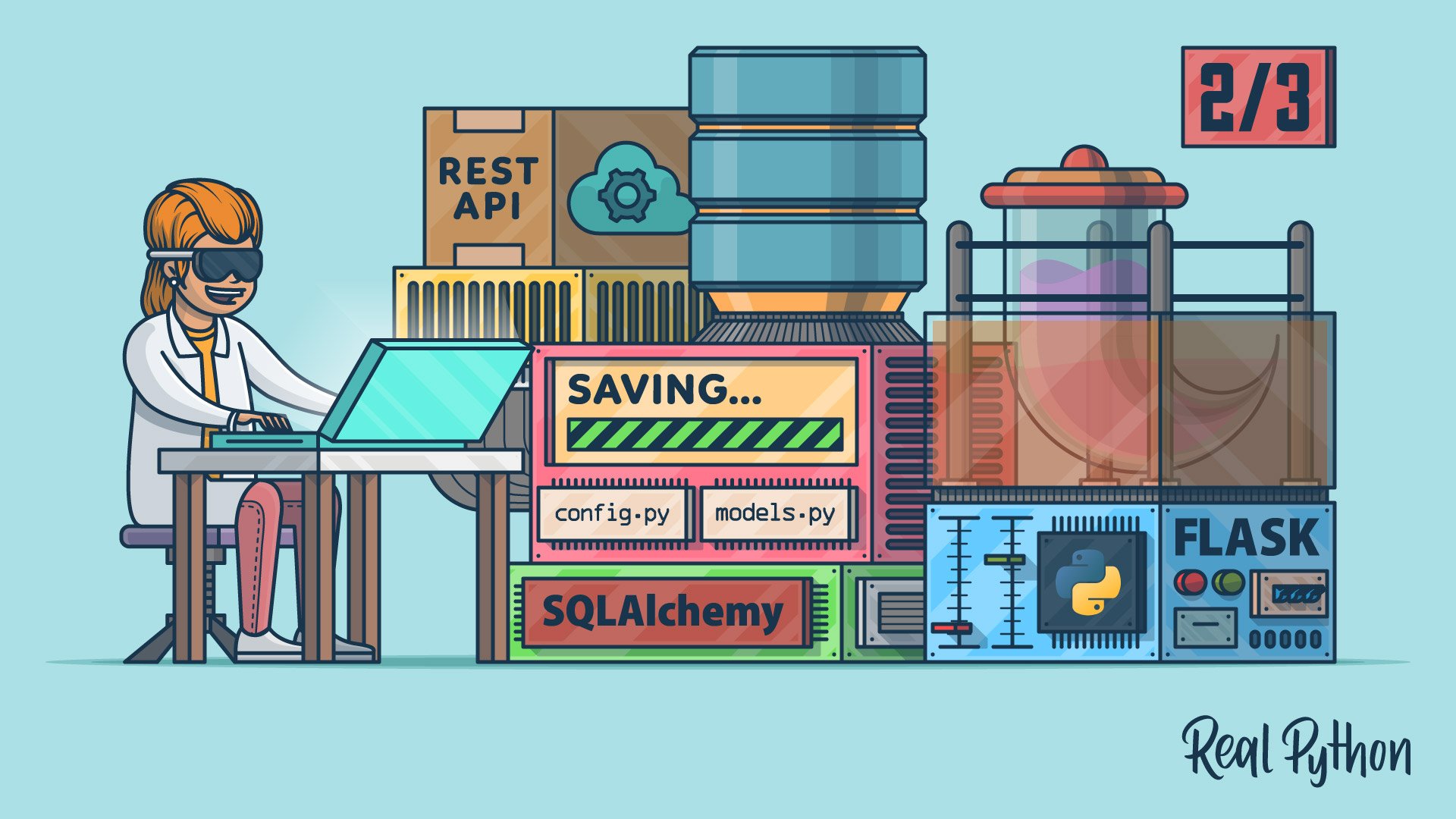
Python REST APIs With Flask, Connexion, and SQLAlchemy – Part 1
In this three-part tutorial series, you'll create a RESTful API from scratch to keep track of people and notes using the Flask web framework. You'll also test your API with Swagger UI API documentation. In part one, you'll build the foundation of your note-keeping app.
Tutorial
Python REST APIs With Flask, Connexion, and SQLAlchemy – Part 2
In this three-part tutorial series, you'll create a RESTful API from scratch to keep track of people and notes using the Flask web framework. You'll also test your API with Swagger UI API documentation. In part two, you'll implement a SQLite database to store your data permanently.
Tutorial
Python REST APIs With Flask, Connexion, and SQLAlchemy – Part 3
In this three-part tutorial series, you'll create a RESTful API from scratch to keep track of people and notes using the Flask web framework. You'll also test your API with Swagger UI API documentation. In part three, you'll use SQLAlchemy to provide the functionality to add notes to a person.
Tutorial
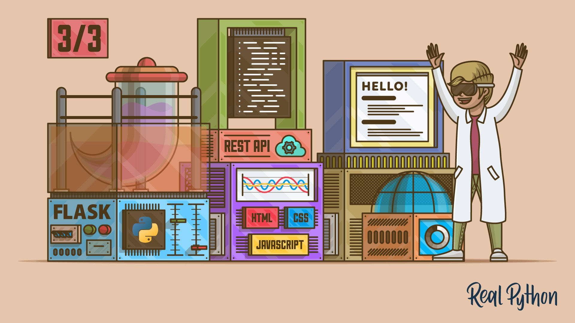
Build a JavaScript Front End for a Flask API
Most modern websites are powered by a REST API. That way, you can separate the front-end code from the back-end logic, and users can interact with the interface dynamically. In this step-by-step tutorial, you'll learn how to build a single-page Flask web application with HTML, CSS, and JavaScript.

Course
Sending Emails Using Python
Learn how to send emails using Python. Find out how to send plain-text and HTML messages, add files as attachments, and send personalized emails to multiple people. Later on you'll build a CSV-powered email sending script from scratch.
Tutorial
What You Need to Know to Manage Users in Django Admin
Learn what you need to know to manage users in Django admin. Out of the box, Django admin doesn't enforce special restrictions on the user admin. This can lead to dangerous scenarios that might compromise your system.
Course
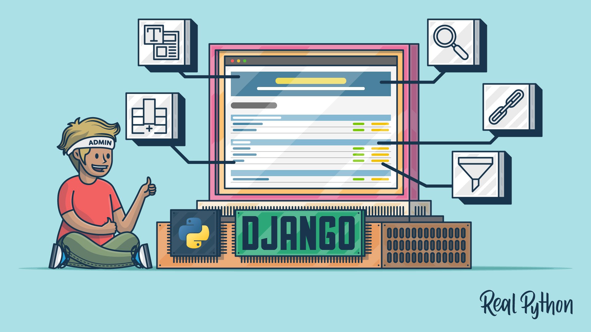
Django Admin Customization
Learn how to customize Django's admin with Python. You'll use AdminModel objects to add display columns, calculate values, link to referring objects, and search and filter results. You'll also use template overriding to gain full control over the admin's HTML.
Got feedback on this learning path?
Looking for real-time conversation? Visit the Real Python Community Chat or join the next “Office Hours” Live Q&A Session. Happy Pythoning!